PUTTING SLAVERY ON THE MAP
January 11, 2013 § 4 Comments
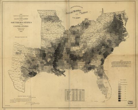
I ran across a most interesting map at the Library of Congress during the holidays. It depicts the percentage of slave population of the southern states, county by county, based on the 1860 census. You can click here or on the map to see it in zoomable form.
The picture below gives you an idea of the scope and distribution of slavery in the pre-civil-war south. The darker the color, the greater percentage of slave population in the county. Washington County in the Delta, for instance, had 92% slave population, while Jones County in the southeastern piney woods, had only 12%. Mississippi’s total population of nearly 800,000 was 55% slave, and only South Carolina, with 57%, had a greater percentage of slavery.
I hate to confess that I had no idea that slaves were as numerous as shown on the map. My ancestors in Vermilion Parish, LA, were poor, illiterate dirt farmers who could not afford slaves. Growing up we learned in school that the same was true of most folks in our area. Yet, when I look at the map, I am surprised that nearly a third of my Parish’s population at the time were slaves. It’s a sobering thought.

The numbers in the Delta are quite small. Bolivar County, for example, is shown at 86.7% slave. The actual number of slaves was 9,078; so the total population of the county was less than 10,500.
That’s mindbogggling, that a thousand or so whites (how many of those were adult males?) could keep so many people enslaved? No wonder they were terrified of slave revolts.
I had thought slavery in the Delta took off only when it was cleared after the war – what a fascinating map. Thanks for posting.
(I also see that Chickasaw County, home of the fictional “Candyland” plantation in “Django Unchained,” did indeed have a relatively substantial slave population.)
I had the same idea about the Delta.